(Don't have an account yet?
Register for free!)
Blogger Template Info
- Author: eBlog Templates
- Views: 20,582
- Downloads: 0
- Added: Mar 14th, 2008
- Rating:
- Live Demo
Blogging Pro Template

If you’re looking for a great make money online Blogger template then I’ve got news for you. Blogging Pro is the latest and greatest web 2.0 template built just for that. This is another exciting cutting-edge Blogger template that we’re giving away for free and all we ask of you is to keep the footer links intact.
You might see some other conversions of this template out there but I promise you’ll find ours to be top-notch and feature-rich. Check out our live Blogging Pro for Blogger demo to see and interact with the template before you even download it!
This template was originally designed for WordPress by Design Disease and converted to WordPress by Blogging Pro. We loved this template but were disappointed we couldn’t find a good conversion for Blogger users so guess what? We converted it to Blogger ourselves!
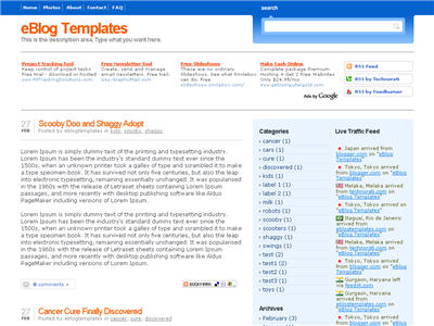
It’s a rounded corners, web 2.0, three column, orange and shaded blue beauty with some great features and widgets you’d normally only find with a WordPress theme. Here’s a list of what’s included:
- Dynamic header tab creation
- Prime location AdSense header ad space
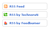
- Multiple rss feed subscription options ready to go (Blogger rss, Technorati, and Feedburner)
- Custom individual post date display
- Addthis bookmark and sharing individual post widget
- FEEDJIT live traffic feed widget
- Custom comments image display
- Three column footer with your recent posts, recent comments, and recommended money maker links
- Amazon deal of the day dynamic widget
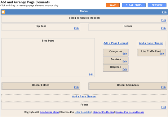
- Clean and organized template layout editor screen
You can see from this screenshot that the actual editor is nicely setup so you don’t need to scroll or try and figure out how to click on the “edit” widget links. Most templates that you download make it tough to edit — not this one!

Now before you can get fully up and running with this new Blogger template, you’ll need to properly set things up. Please follow the steps below and read items carefully. The same questions are usually asked over and over by people posting comments, yet the answers are usually right in front of them. This is especially true for why the post date might not be working on your blog.Let’s start from the top of the template and work our way down each item. Don’t be too surprised when the template doesn’t look like the screenshot when you first load it up. You’ve got some configuring to do first! 🙂
Top Tabs Setup
This is actually pretty easy since the top tabs are a link list. You don’t need to alter the template code. Just go into your Blogger page layout and click on the “edit” of the “top tabs” widget. Start adding new links and then save. A “home” link will automatically appear once you setup this widget so you won’t need to add one. Save and refresh your blog to see the pretty new tabs you just created. Here’s what it should look like (different names of course)
![]()
Configure The Three Header RSS Links
This section is actually setup to dynamically work except for the Feedburner link. You’ll first need to have a FeedBurner account. If you don’t already have one, please read the “How to Setup FeedBurner on Blogger” article and then come back.

Once you’ve got your FeedBurner account, you’ll need to edit this template code and replace a few parts. Search your template code for the following text: <strong>YOUR-FEED-NAME-HERE</strong> . Replace the text with your FeedBurner name (i.e. eBlogTemplates is ours)
After you’ve changed this link save your template and check to see if it works. If you’re having trouble finding your feed name or id, please read our article above or see FeedBurner’s help section to locate it.
Header AdSense Setup
This is a great location for showing ads and we really like how the designer laid everything out. The default ads are just a placeholder but of course feel free to use them until you find a replacement. You’ll need to again edit the template code to swap out the ads. Search your template for <div class=”Syndicate”> and right below that is where you’ll find the ad code block.

Remember, when you paste in your own ads you will need to convert the ad code into a workable Blogger format otherwise you’ll get an error when trying to save it. Use our free AdSense Code Converter to change it automatically for you. You can also look at the existing ad code included in the template and use it as a model.
Individual Post Date Setup
This is a very important step and one that most people think is broken when they install the template. It’s not folks. You just need to go into your Blogger settings and make a small change before it will work.
After you install the Blogging Pro template, go to your Blogger’s “Settings” => “Formatting” and look for “Timestamp Format”. Make sure you change it to this format: “Tuesday, January 25,2008? as shown below.

This needs to be set in this format otherwise the date won’t show up properly on each of your posts! Actually the date will most likely be blank and you’ll think the template is broken. Remember to change the TIMESTAMP FORMAT (fourth item down on the page) and NOT the Date Header Format option.
Amazon Deal of the Day Widget
This is actually a really cool widget put into the sidebar by default. If you have never heard of Amazon’s “Deal of the Day” then you’ve been missing out! Basically each day Amazon has one special item they drastically reduce in price.
Before you’d have to visit their site to see the deal but now it gets delivered directly to your Blogger site! If you want to replace or remove this widget you’ll need to edit the code and look for the following text “amazon-widget”. The line of code below that is the actual Amazon widget so just remove or replace it.
Footer Recent Posts and Comments Widgets
I really love this part about the template. In the past, your footer was an overlooked piece of real estate on your blog. With this template, it makes good use of your footer like many of the other pro bloggers out there today.

This one is easy to setup since we’ve already written an entire article dedicated to this. Please see “How to Setup Recent Comments and Posts Widgets” to configure these two widgets. These two widgets will both appear in the footer once you configure them properly. It’s a very good use of space and provides search engine spiders an entry point into your blog content.
Recommended Money Makers Section
This is the other footer element which comes already setup with our recommended money maker links and programs. This idea came from the ProBlogger.net web site and we included it in our template. You are welcome to keep the links intact or feel free to replace them with your own. You will need to edit the template code to swap them out and also have affiliate accounts setup with each vendor. It’s easy if you don’t have any accounts. Just click on each footer link to setup a new account. Search your template code for “Recommended Money Makers” and you’ll see the links below that.
Live Traffic Feed Sidebar Widget
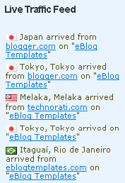
This is a really cool feature within this template and the best part is you don’t need to do anything to setup it up! There are some further options if you click on “options >>” on your actual blog page under the widget but that’s it. This is a sample of what it will look like once you start generating some traffic (or more traffic) to your blog.

You should now have the template all setup and ready to go. I hope you enjoy this beauty and please make sure to keep the footer links intact since numerous hours of my time and the original designer were put into making it. That’s all we ask for giving away this template! Enjoy!
Thanks again to Design Disease and the Blogging Pro guys for making this wonderful template available for free. It was a great challenge converting it to Blogger but it was well worth the trouble.
Ready to super charge your blog? Check out our professional premium blogger templates or make money by joining our blog affiliate program!
Want to make your blog stand out from the crowd? I recommend giving your newly downloaded Blogger template a unique and personalized look. Read our Free Blogger Header Images article and find yourself a great custom header image!
If you like this post then please consider subscribing to our eBlog Templates RSS feed. You can also subscribe by email and have new templates and articles sent directly to your inbox.
Blogger Sponsors
- Improve Your Blog in 31 Days – Guaranteed
- Build a Better Online Business with WordPress
- Become a Blogger Just Reopened – 5 Days Only!
- Roadmap to Become a Better Blogger
- Free Image Hosting – Photobucket
- How to Install Google Analytics on Blogger
- Improve Your Google Rankings in One Easy Step
- 50 Excellent Blog Footers
- Free Instant Blog Logos
- Create Cool Images With a Wet Floor Effect Maker


I have a problem with recent entries & recent comments because its blank..nothing appear when I click edit on Page Elements so I cannot enter my RSS feed URL..Please help i want to make my footer just like it is shown. Coz its kOOl plz help
he new widget id “Recent-Posts-Widget1” is invalid for type: Feed
how to solve this error?
Check Out Uncovering Blogs.
Hellraiser, I have done some work on the Blog Archive expanding problem and the styling on Uncovering Blogs.
I hope it is of some use to you.
this site very useful and helpful for every one.
nice tips about making blog.www.healthofcancer.comkeep running it.
The adsense code is just a placeholder and there for you to replace. Just plug in your adsense id and it’s ready to go.
Tracy,
The best way to find the graphics is to open your template HTML and you will find the http address for each graphic. Just copy the whole address between the brackets, paste it into your browser address bar and you will go straight to the .png file. From there it’s easy to find the Blogging Pro file by clicking the link at top left.
To make it easy here’s the photobucket page address. Just click on each thumbnail to go to the graphic and you can then download it.
If you want to get the other features of your template working you will find the answers here at Uncovering Blogs
Hello, can you edit the template so that it has an embedded comment form?
eblogplace
I posted an answer to this on 23 March, 2009. It is on Uncovering Blogs.
If you are not using AdSense or something else in your header section, or if an ad blocker is used by blog visitors the header section collapses and partly covers the RSS buttons.
The cure is to add a minimum height to the .syndicate CSS properties. Full details here.
your blog templates r very nice .my suggestion is keep running your site.
prefabrik evler,prefabrik ev fiyatları
amazing templates in this site.
We were unable to save your template
The new widget id “Recent-Posts-Widget1” is invalid for type: Feed
i gt that problem,,, help me plz
RE: The adsense placeholder at the top ….
I used my own Google ad code and it wouldn’t work. I used the Adsense converter noted here and it still wouldn’t work. I even tried to enter my code manually. No go.
*****
This is the “google info” for the original placeholder:
google_ad_client = “pub-7484875210524064”;
google_ad_host = “pub-1599271086004685”;
*****
When I use the converter, it lists my own google publisher code as the same number as both the ad_client and the ad_host (and not two different numbers as the placeholder does).
It’s still not working (getting “page not found” on that field). Any ideas? Thanks much.
thanx for all this information
even i have my own blog for the Magazines ,movies, games, software, TV Shows, eBooks, Misc
even every one can get the benefits frm this blog
http://www.fassy-downloads.blogspot.com
Thank for eblogtemplates…
i like this template.
my blog is :
Paul, belated thanks for your response.
For some reason I was unable to access the graphics via html and/or by using the url of the graphics. I almost gave up until I ran the site through a browser checker (which SHOWED the graphics, and this is AFTER I verified the graphics were “gone” using different browsers on my own computer and friends’). A few days after my last post, the graphics “magically” reappeared after being gone for almost a month. I’m not sure what happened there. Just glad they’re back, because I LOVE this template!
I love this blog template, thanks!
But I face a problem:
When I try to edit the “recent entries” and the “recent comments” feed, the page that came out after I clicked on that looked exactly like this:(http://picasaweb.google.com/lh/photo/GubPk6U2JDRplA5L2x-26g?feat=directlink)
Please help me with this problem! Thank you!
rich01:
I posted an answer to this on 23 March 2009. It happens because Blogger changed the way that feeds are handled. See Uncovering Blogs.
Thanks paulantczak.
My problem is resolved with your help!
hi…why I cant download your template? it says page not found..pls help i want this template. thanks
Insider-Insights:
I have just tried and it downloaded perfectly. Maybe it was just a busy server and all you need to do is try again.
I’ve downloaded it and test it in my test site it was really awesome, but I need help can I widen the margins? I want to put larger photos and I can still see some free spaces on the left and right margin of the full screen I want to use it to adjust my photo size. Really want larger photos pleaaaase help.. another thing can I change the sidebar with white background only? I’m lovin this template!
Hi Paul,
I have already downloaded it I think your right it was a busy server when I download it earlier..thanks a lot
hy,, thX 4 d tmplte
but i hv a prblm again.. my search engine plz help me
plz chek my page
feyw:
You have put two search boxes into a space designed for one. The background is a graphic so it cannot expand to take two.
If you want to keep both search engines then I would suggest changing the Google search so that the search button is below the box and then moving it to the sidebar with a header such as “Search the Web” or “Google Search”.
If you only want the Google search then you will have to remove the code for the original search form. You may have to make some slight adjustments to the CSS.
I just downloaded the daya earth template and I keep getting this error when I try to upload to blogger:
The new widget id “Recent-Posts-Widget2” is invalid for type: Feed
I see others have had this problem, but no solutions, other than jabronism’s (which I tried and didn’t work).
Please help! Thanks!
Daniel,
Blogger is quite right the widget id is invalid as Blogger requires all widget ids to match the widget type.
The full answer is too long for a comment so I have posted an article here to explain the cure for this problem. Uncovering Blogs.
I downloaded Daya Earth today and successfully uploaded it to a test blog after making the changes.
Paul, great – I’ll check that out. I hope I can get it to work – it looks SO cool! Thanks!!
Dan
i’m new to blogger, thanks it really helps me out.
Paul Antczak
thank,,,
but how to replace google seach in the search box???
i dnt knw abt xml or rss code
teach me T_T…. huhuhu
feyw,
Using AdSense For Search In Blogging Pro
You have placed some AdSense code in the wrong place in your template. That is what is breaking the layout. You need to remove the AdSense code, so I have written an article to show you how.
I also show how to use Google’s AdSense for search instead of the supplied site search. See Uncovering Blogs for this article.
A sample is here on this test blog.
I hope it sorts out your problem.
very exclusive Templates
see this link to get more exclusive Template
thanks Paul Antczak
you’re the master!!!
btw,, are u hv artcle to make ads and othr link open in new window????
Feyw,
You don’t need an article for that. All you need to do is add target=”_blank” to your a tag like this.
a href="THE URL YOU WANT" target="_blank". Don’t forget the . I didn’t put them as I did not want the code to disappear into a link.Try this to take you to the home page of eBlog Templates.
Feyw,
I am repeating this because I put the brackets around the word brackets and the whole word disappeared. And I typed too quickly and left the r out of target.
You don’t need an article for that. All you need to do is add target=”_blank” to your a tag like this.
a href="THE URL YOU WANT" target="_blank". Don’t forget the brackets. I didn’t put them in as I did not want the code to disappear into a link.Try this to take you to the home page of eBlog Templates.
Feyw,
That’s twice it did not work. Final try.
You don’t need an article for that. All you need to do is add target=”_blank” to your a tag like this.
a href="THE URL YOU WANT" target="_blank". Don’t forget the brackets. I didn’t put them in as I did not want the code to disappear into a link.Try this to take you to the home page of eBlog Templates.
paul …
why my post ws broken whn i try place ads retangle in my post… 3 post above
sorry my english too bad
Feyw,
you are only allowed a maximum of three AdSense ad units and three AdSense link units on a page.
You have one at the top and I assume you placed them under your post using the Blog Posts widget on Layout>Page Elements.
Now you have placed them in your posts as well, so Google is cutting you off at three which is why you have the large gaps on your home page. But, they are displaying properly on your post pages.
Have a look at this on Tech Dreams it might help you to display them only on your post pages and not on the home page.
thank you eblogtemplates
veyr good templates
thankz a lot paul….
i’ll try….
youre so kind
if i hv problm agn mybe i/ll ask u again….hehehe
Search box untidy display in Safari Browsers
The search legend is not hidden in Safari Browsers and makes the template look untidy. There is a quick fix for this in this post on Uncovering Blogs. This should make your blog look more professional to Safari Users.
wow that’s beautifull template
i love it…
thank you eblogtemplates
Paul –
You’ve managed to make the Blogging Pro template a lot cooler. Thanks a lot.
I have a request/question… Is it possible to get the year/count on the same line as the arrow symbol?
e.g. > MAY (3) or > 2009 (5).
I hope you understand what I am trying to say.
Please have a look at my blog and let me know if I could improve it aesthetically.
http://internetstatic.blogspot.com/
– Sitanshu
Sitanshu,
Yes it is possible. After scratching my head for a while I found that a few lines of CSS would do it so I have put a short post on Uncovering Blogs.
I have put it in my blog for the moment so you can see what it looks like.
Thanks a lot Paul. You answered my question. I will have this changed in a little while.
Yesterday I spent the entire evening trying to figure out why the template graphics wouldn’t load! Finally I moved all the Photobucket links to my account. It’s back to normal now.
– Sitanshu
Life Got Me
Paul –
Have you noticed that the bookmark and share button for a post only appears on the most recent post in this template?
I saw it on my blog Life Got Me and noticed the same on yours too.
I don’t know if this is by design.
– Sitanshu
Sitanshu,
Yes the share button really only needs to appear once on a page as it shares the URL of that page. So the Bookmark and Share button on the home page will bookmark your blog’s home page. To bookmark or share an individual article you need to use the button which appears at the end of each post page.
So far all your posts are quite short so you do not use Read More to show the full article. Unless someone wants to leave a comment they do not need to go to the post page where the button will appear. You can also get to the post page by clicking on the title of your post. If you look you will see that it even appears on your first “Hullo World” post.